Katie Fridman is a Melbourne / Naarm based designer.
See work below, say hi above.
Chong Office
Studio TunTun


Chong Office is the artist practice of Casey Chong. Working closely with material, aesthetics and the senses to bring together eccentric yet functional artworks that border furniture, sculptures and crafted objects. As a brand, Chong Office embraces the ambiguity and contradiction throughout creative processes and refuses to be categorised by style or identity. For this, Chong Office is both predictable and unpredictable.
Studio TunTun developed a layered identity that embraces the contradictions within Chong Office.
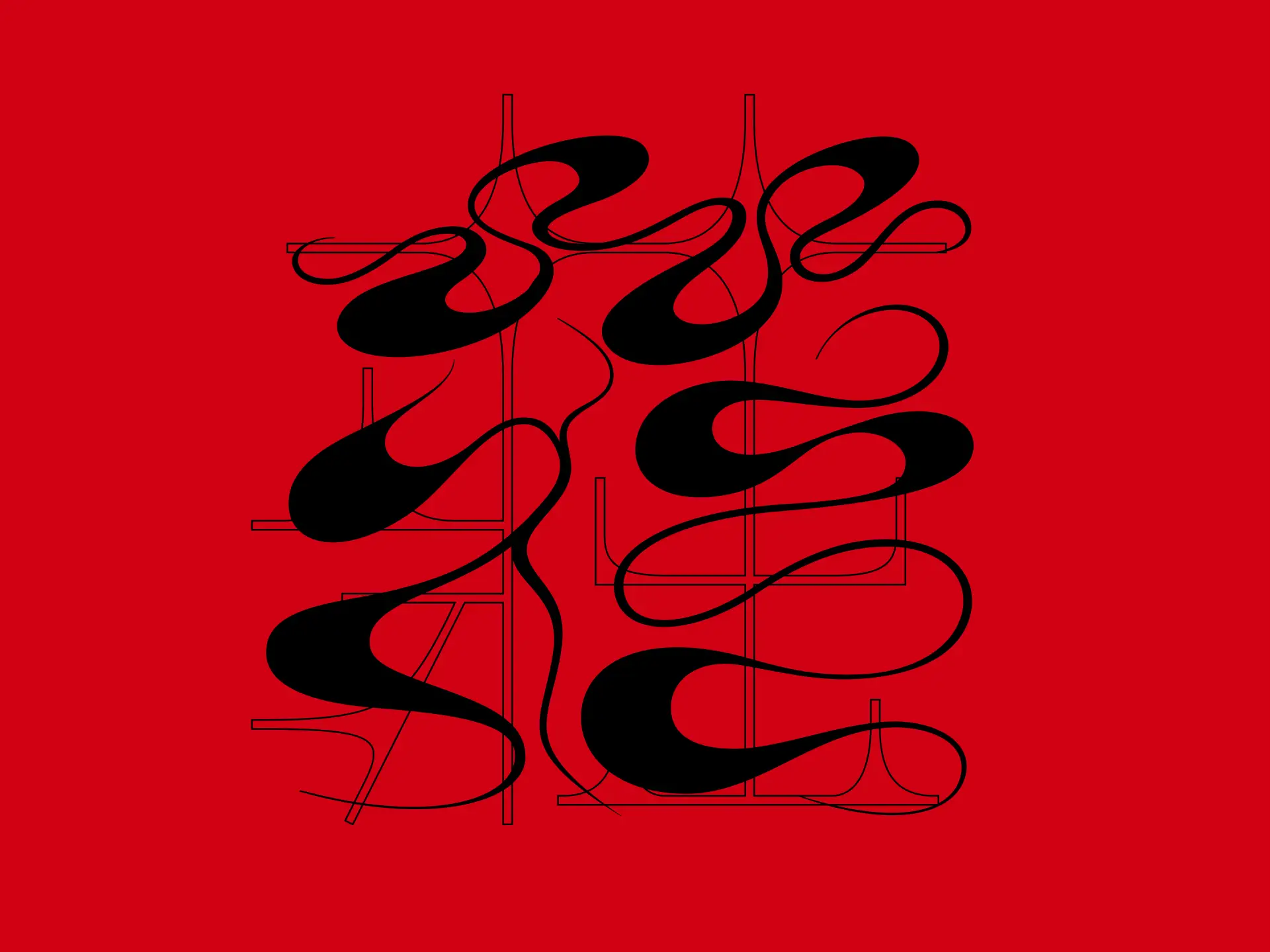
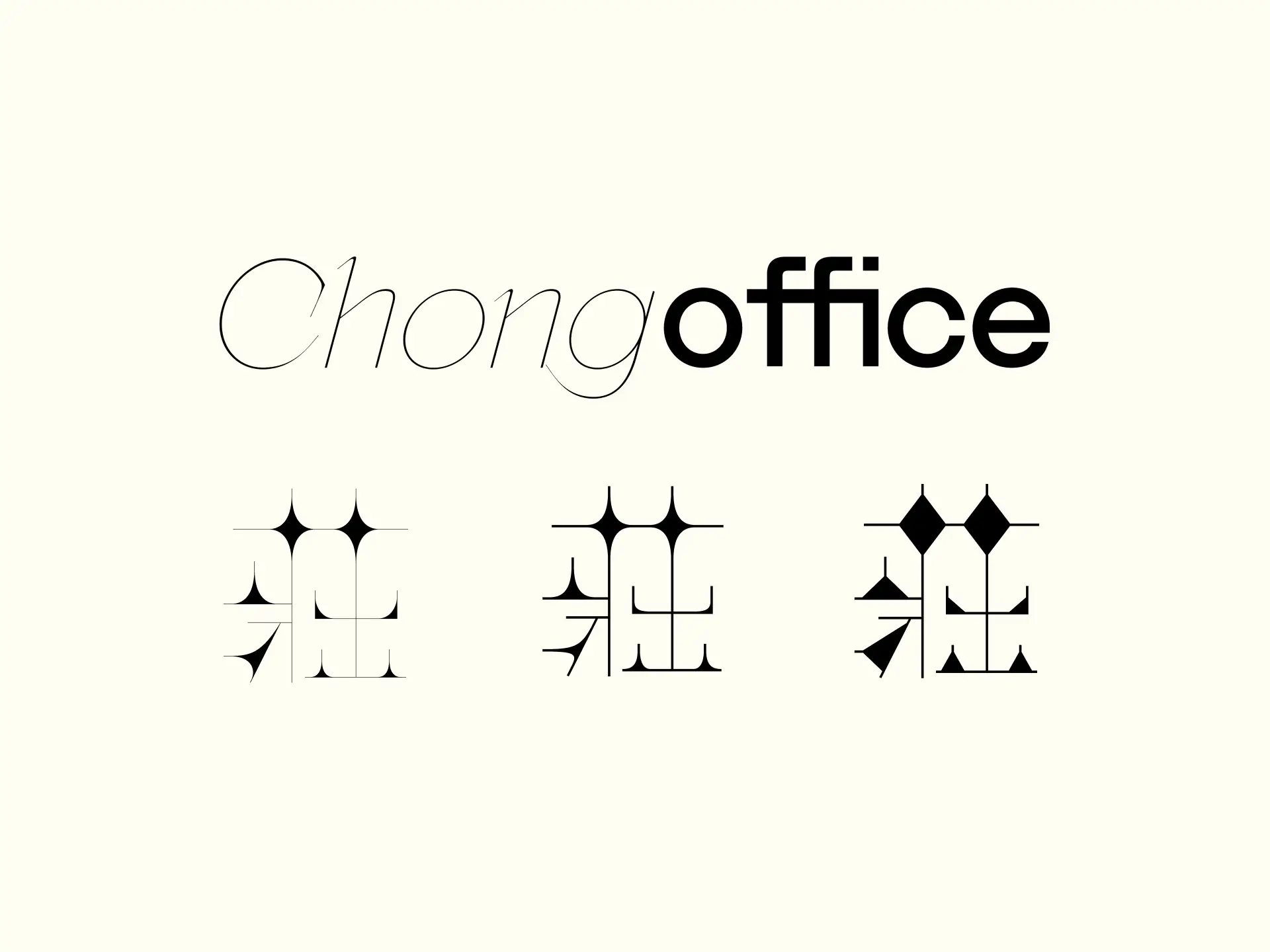
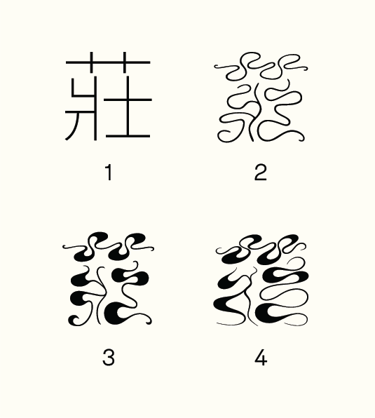
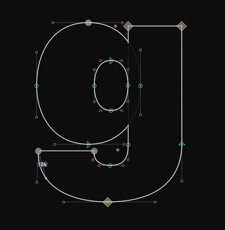
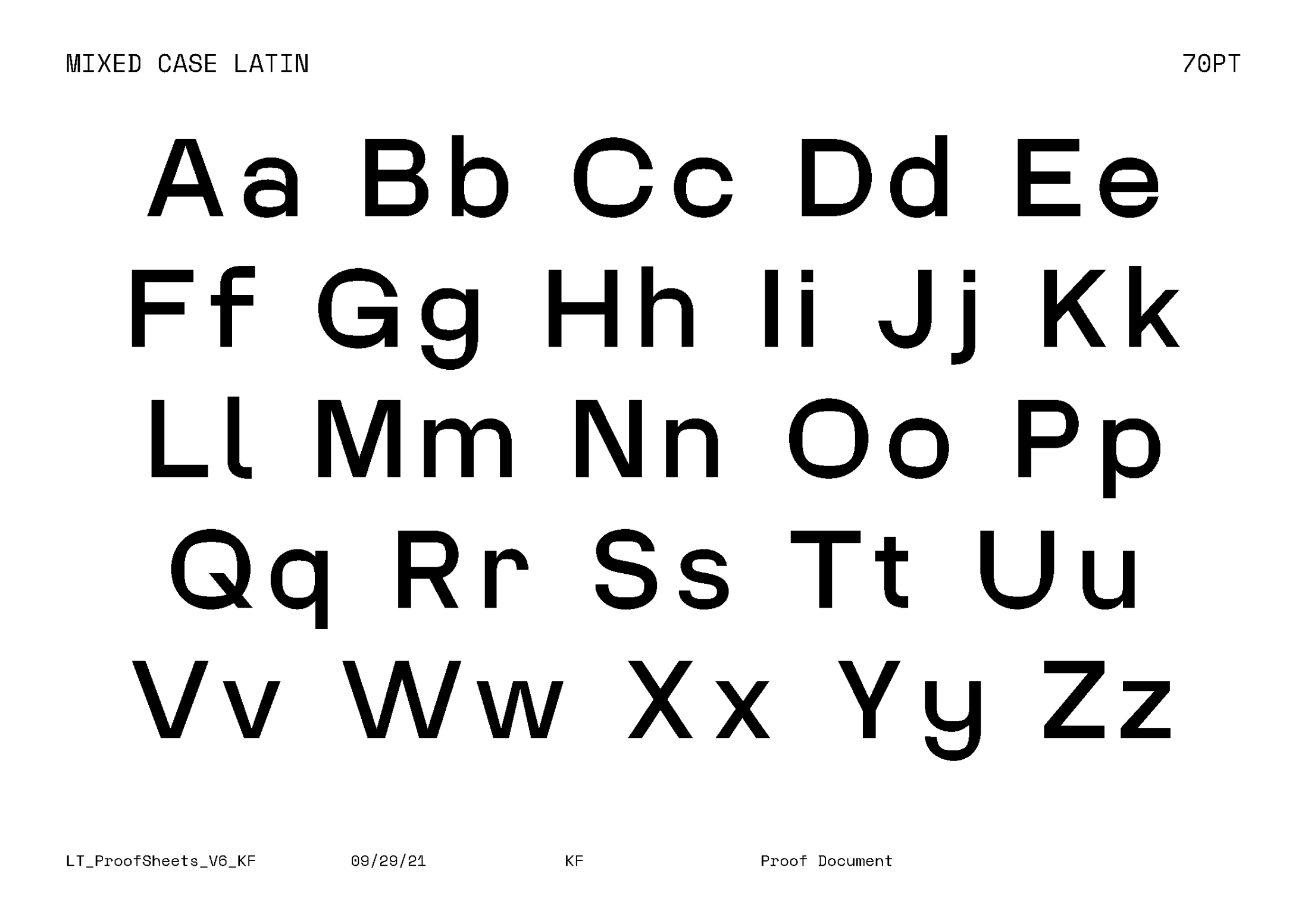
Six typographic logomarks in both latin and traditional Chinese scripts underpin the brand, with the logo being a vivacious interpretation of Chong’s family name in Chinese character [ 莊] (the top part of the character means ’grass‘ whilst the bottom half represents ‘strong’). This typography translates to the expressive nature of Chong Office’s forms into a system that seamlessly flows from digital to print with artist seals applied to each physical piece.
The colour palette is purposely small and subtle with a cold grey with a tint of blue to evoke materiality. The rich black represents confidence in application and the cream white acts as the gentle overlay that is delicate and articulate.
The logomark is used by Chong Office as a makers’ mark, stamped into each piece.
Studio TunTun developed a layered identity that embraces the contradictions within Chong Office.
Six typographic logomarks in both latin and traditional Chinese scripts underpin the brand, with the logo being a vivacious interpretation of Chong’s family name in Chinese character [ 莊] (the top part of the character means ’grass‘ whilst the bottom half represents ‘strong’). This typography translates to the expressive nature of Chong Office’s forms into a system that seamlessly flows from digital to print with artist seals applied to each physical piece.
The colour palette is purposely small and subtle with a cold grey with a tint of blue to evoke materiality. The rich black represents confidence in application and the cream white acts as the gentle overlay that is delicate and articulate.
The logomark is used by Chong Office as a makers’ mark, stamped into each piece.
Link Sans
Linktree x Average Type Service
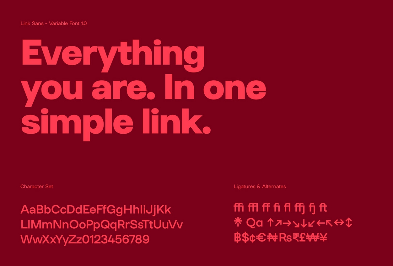
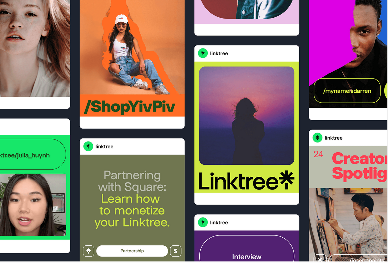

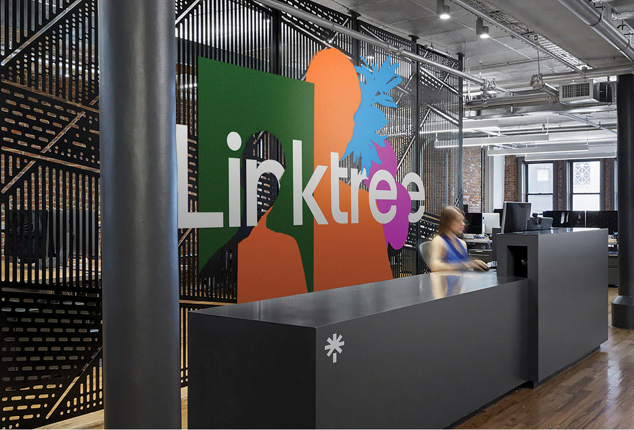
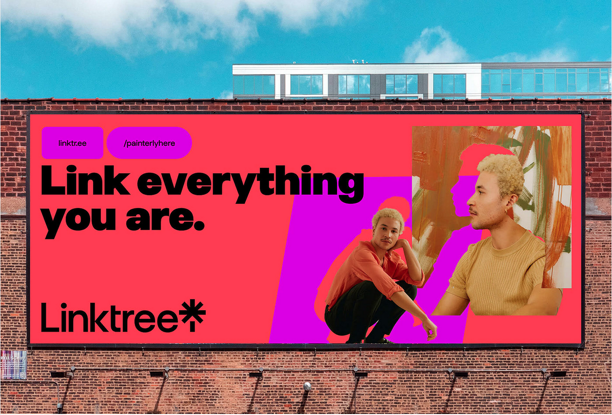
As part of their brand overhaul, Linktree comissioned a custom variable typeface. The playful sans sings as part of Collins’ new brand identity, but throughout the design process, it was also understood as a brand asset that will underpin future visual directions for Linktree.
I was part of the ATS team, which worked closely with the Linktree brand team and Collins to deliver an honest, quirky typeface grounded in world class research for acessible and mustiscriptual applications.
For maximum flexibility, we constructed Link Sans with metrics that will allow effortless expansion into multiple scripts and languages.
Karrkad Kanjdji Trust
Ellis Jones
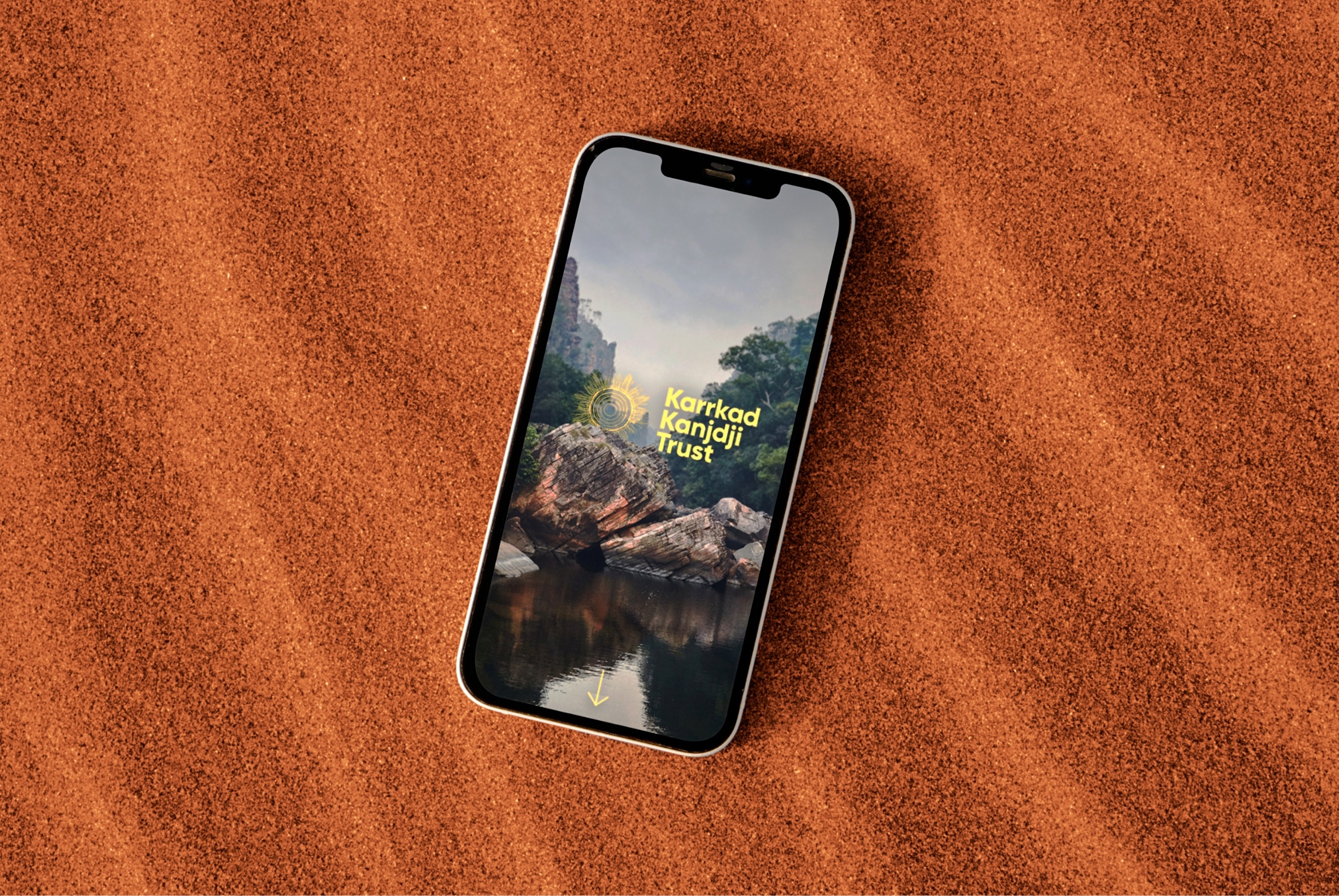

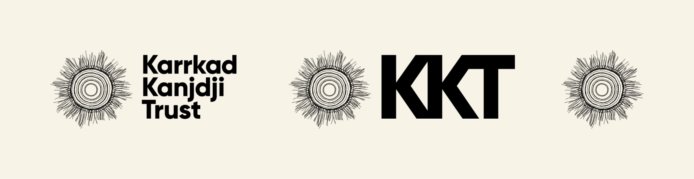
The Karrkad Kanjdji Trust (KKT) brings together Indigenous ranger groups, communities and philanthropists to address some of our nation’s most pressing issues. These include regenerating our natural environment, taking action on climate change, creating meaningful and equal employment opportunities, and supporting the continuation of the world’s oldest living culture.
KKT’s refreshed brand and new website launched in mid-2023, bringing their refreshed brand identity to life through dynamic motion, bold colour, and expressive interaction design. A modular design toolkit, and purpose-built CMS allows site and content owners to build out new content, case studies and news stories with no external development support.
KKT’s refreshed brand and new website launched in mid-2023, bringing their refreshed brand identity to life through dynamic motion, bold colour, and expressive interaction design. A modular design toolkit, and purpose-built CMS allows site and content owners to build out new content, case studies and news stories with no external development support.


Trocadero Projects
Personal (ongoing)


In 2024 Torcadero Projects rebranded to coincide with a new gallery space in the heart of Footscray. I worked closely with designer Alex Margetic to refresh the Trocadero website and identity.
The brand rollout begins with the first exhibition of 2024, Surfacing, presented in partnership with Queer PHOTO and Midsumma.
The brand rollout begins with the first exhibition of 2024, Surfacing, presented in partnership with Queer PHOTO and Midsumma.